Creating Instagram Carousels in Canva Without Unwanted Mobile Cropping
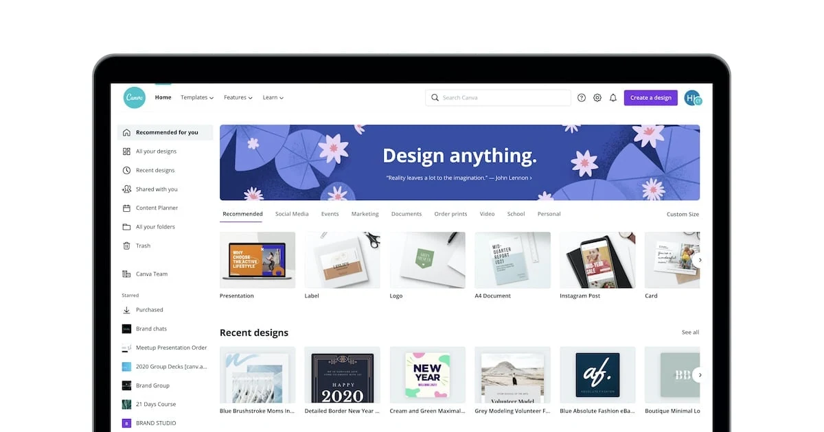
It's easy to prepare carousel in Canva. What's difficult is that the design not only looks good on the editor, but stays smooth on the Instagram feed, the phone, and the profile grid.
Canva Design School gives a measure of 1080 ⁇ 1350 in the vertical feed sample for Instagram and emphasizes that previewing is important in both the feed and profile grid before releasing the carousel design.
For me, the problem is usually not "which font?" or "what color?". The whole carousel remains in the same visual system.
Try 1080 ⁇ 1350 from the beginning
If you are preparing a vertical Instagram carousel, opening the startup file 1080 ⁇ 1350 is one of the cleanest methods.
Making the design square and extending it to 4:5 last, it can disrupt their text and visual balance.
First select the format, then design it.
Social Media Visual Dimensions You can control different platform formats in one place.
Do not design each page as a separate poster
One of Carousel's most common mistakes is that the first page carries another, the second page carrying another, the third page carrying a completely different design language.
Not every page needs to be the same, but there must be a common system:
- Same outer space.
- The same hierarchy of titles.
- Same grid.
- Same page number location.
- Consistent visual language.
- Similar CTA field.
When the reader moves from one page to another, it should not feel as if it has fallen into the skin of another brand.
Do not paste the text on the edges
1080 ⁇ 1350 accepting the entire canvas available space compresses the design.
Bringing in title and body texts to breathe through the edges makes both readability and possible crop scenarios safer.
This is not only for Instagram; it also makes your job easier when you want to adapt carousel to Pinterest, LinkedIn or other formats later.
The task of the first page is not to tell everything.
Do not try to give all the information on the cover page.
The work of the first page: To make the right person say, "This is for you."
For example, the bad cover:
10 Important Article You Must Do to Succeed on Social Media
Clearer cover:
Why Are Your Reels Clipping?
The second title directly illustrates the concrete problem that needs to be solved in content.
Test text size on mobile
When designing on a large monitor on the desktop in Canva, a small article may appear quite legible. The situation changes when the same design is smaller on the phone screen.
So check each carousel with a preview close to the phone size before publishing it.
In particular, thin fonts, light grey text, long paragraph, dense table and small footnote can quickly become unreadable on mobile.
Visual continuity between pages
The "seamless carousel" designs in which an object or line flows from page to page can be impressive, but that alone does not mean good content.
First the information flow, then the effect.
I prefer to set the content order as follows:
- Problem.
- Why not.
- First solution.
- Example.
- The second solution.
- Not to be done.
- Brief summary/CTA.
This is not a fixed template. It depends on the subject, but the principle of "a new function on every page" protects carousel from unnecessary extension.
Remember profile grid
Canva's current carousel guide also points out that platforms can show content differently in feed and profile grid.
So it's important not to overstep the critical title and visual.
Prior to the broadcast Instagram Safe Zone You can see the risk of clipping faster by checking your visual in your vehicle.
My last checklist
Before you export Carousel:
- Are all pages to the same extent?
- Is the cover read in a small view?
- Are the texts too close to the edges?
- Does every page say anything new?
- Is there unnecessary repetition?
- Does the last page say what to do?
- Grid/profile crop checked?
Canva gives speed, but when speed precedes format and information architecture, "carousel" appears that looks beautiful but is not read.
Good carousel I think first Flow, then design.
Güncelleme: AdSense kalite denetimi: canonical tamamlandı